Southwest on Windows Phone
A mobile app for Southwest Airlines on the Windows Phone platform
Interaction and Visual Design
January - February 2013
“Design question: How can a balance be found between the styleguides of a brand and a mobile operating system?”
Background
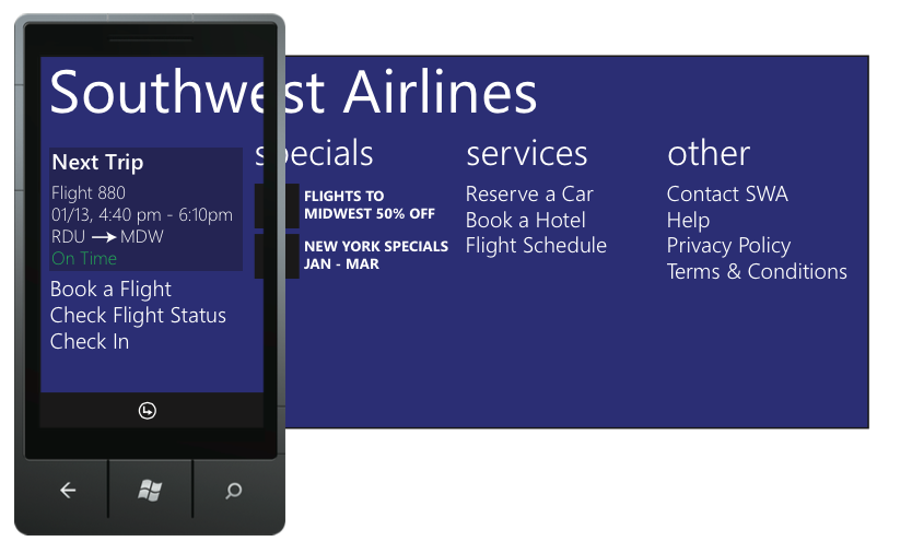
The Windows Phone design language (then branded as Metro) integrates a company's brand - colors, logos - seamlessly while still being easy to identify as Windows Phone. I had read the Metro design guidelines but wanted to see if I had truly understood them and if I could apply the styleguide guidelines effectively. I chose to create a fake Southwest application and focus on visual design in addition to interaction design.
(Please note, this was not at all affiliated with Southwest Airlines, I was just using it as an example)
Design Problem: Design a Windows Phone App for Southwest Airlines
Research
To start with, I had two main areas of research
Windows Phone app design: I read the guidelines and tried using applications on a Samsung Focus running Windows Phone 7.5 (Mango)
The current state of airline mobile apps: at the time there weren't any airline apps on Windows Phone so I did a competitive analysis of iOS and Android applications. I looked at United and American Airlines on both OSes.
Design
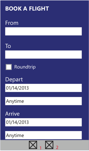
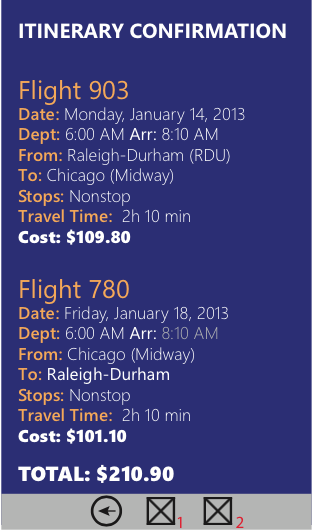
I focused on the key task of purchasing an airline ticket to design out as the main design task while also taking into account features like Tiles. Instead of traditional wireframes, I went straight into visual design mockups since the design is already very flat.
Click on a picture for more details

Next Steps and Lessons Learned
Since these were first iteration wireframes/visual designs, I would have gotten a design critique before proceeding with user testing. However, my Focus had a broken screen that was almost unsafe for anyone to handle, so testing was not possible.
I did learn to keep my wireframes and visual designs separate for future projects. Though it would have taken me more time to do both separately, I found it was better to think about the two separately so I could focus on each one without being distracted by thinking about the other.