Tumblr Responsive Design
Interaction Designer
November 2013
Background
Tumblr is a social network based on microblogging that has mobile applications for iOS, Android, and other platforms which were built after the site. After looking at the site and mobile applications on several devices (iOS on tablet and phone, Android on phone), there are some differences in navigation patterns as well as a few usability issues: horizontal scrolling for tags (this conflicted with event handlers for changing tabs on mobile), text sizes, and other differences that made for a different experience depending on the device a person was using. I was interested in responsive design patterns, so I wanted to reimagine Tumblr with a responsive design as a fun design exercise.
“Design Problem: Create a design that can function on both desktop and mobile. Make the interactions consistent without altering task flows too much”
Research
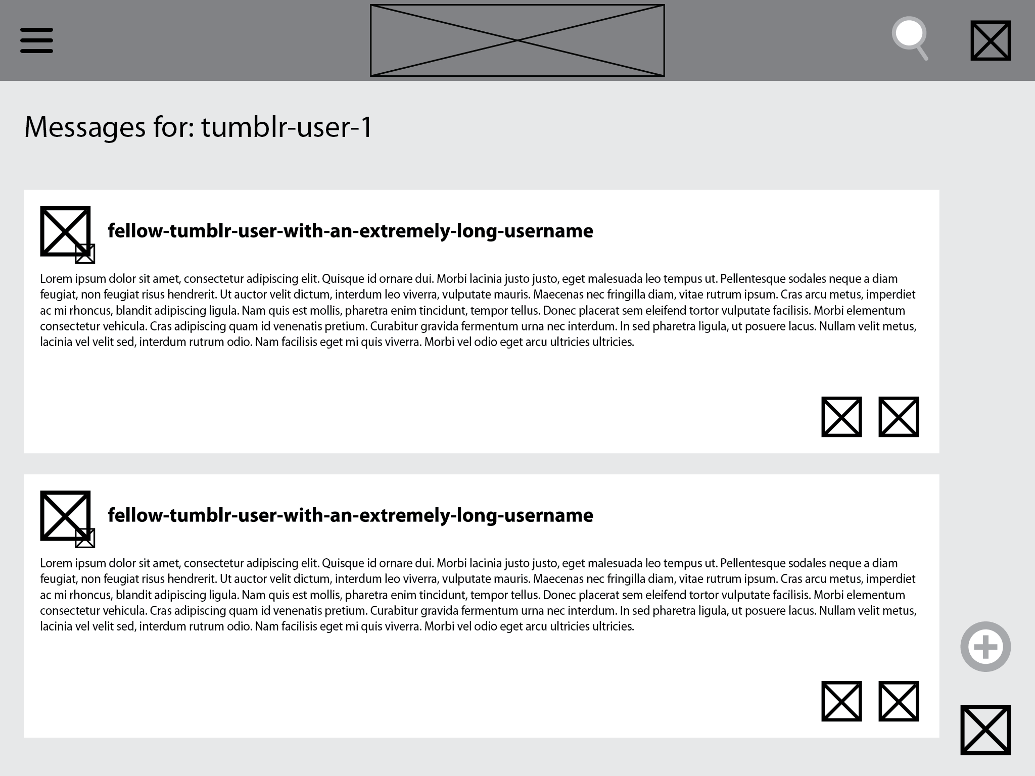
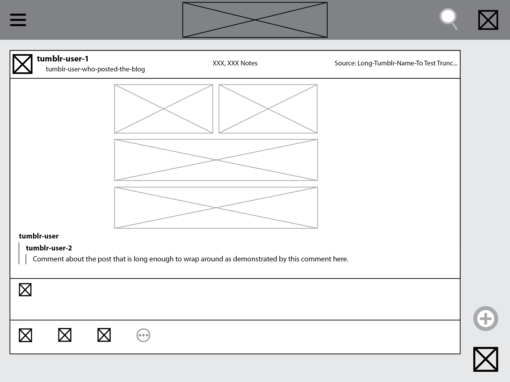
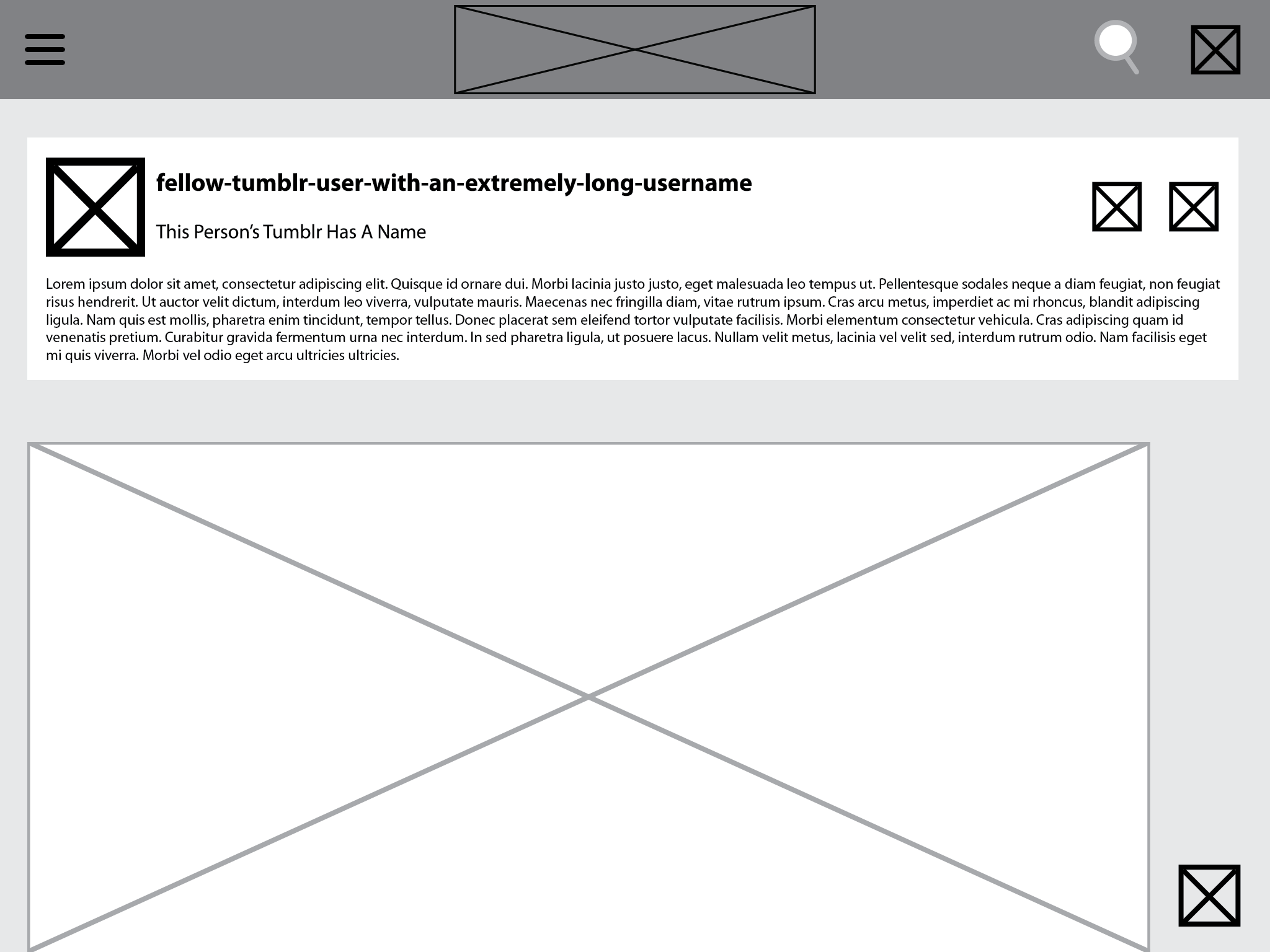
I started by taking notes on the different versions of Tumblr to compare them. For desktop I tried it on a 15'' MBP; for mobile I tested it on an HTC One X for Android and an iPad and iPod Touch for iOS. I identified key tasks:
Scrolling through the user's dashboard
Viewing a user's profile and posts
Posting
Once I found the differences in the interactions for these workflows, I sketched ways to standardize them which evolved into wireframes - I ended up focusing on altering the main navigation of the application which didn't alter tasks like scrolling and posting too much since those were a pretty consistent experience across all devices.


Next Steps
I tested my designs on the HTC One, the iPod Touch, and the iPad but was unable to get any user testing done since I had no access to users that were familiar with Tumblr; if I had, I would have done some AB testing by creating wireframes of the then-current version of Tumblr to strip out the visual design and test the navigation. I also would have had to test my screens on larger desktop screens before moving forward.