MetMusic
A mobile app where visitors to the Metropolitan Museum of Art (the Met) can "play" instruments from the museum's collection to learn more about them
UX Designer | Collaborators: Carl Farra, Reynaldo Vargas
Designing for the Met, Spring 2016
January-May 2016
“Design Question: How can visitors to the Met have a more hands on experience with a museum’s collection without directly touching them?”
MetMusic is an imagined feature of the Metropolitan Museum of Art’s mobile app where visitors can "play" the instruments using their mobile device to simulate the instrument. Visitors can explore the different sounds of the Met's collection of instruments while learning about what makes each instrument unique. MetMusic was developed with the Met as our client and partner for the Designing for the Met class at NYU Game Center and was first exhibited at the Met Media Expo in May 2016.
I was the UX designer on the project working on the information architecture, interaction design, and visual design.
The Making of MetMusic
Background
Designing for the Met was a class designed to give students the experience of what it’s like to build a game/playful experience for a client, from pitching a concept to presenting final deliverables. Our client was the Met MediaLab, the R&D center of the Metropolitan Museum of Art.

Initial Research
The Hall of Musical Instruments showcased the Metropolitan Museum of Art's amazing collection of instruments from all around the globe
As research for the class, we went around the galleries to understand the space. While exploring the musical instruments gallery, we got insight into what a visitor may experience walking through the gallery - for example, the instruments are close enough to touch but visitors are not allowed to do so.
The gallery is also mostly silent; what could we do to bring life to objects that are centered around sound?
Outcome: conducted foundational research to create first concept
Project Pitches
Each student was given an opportunity to pitch an idea to Marco, the manager of the Met MediaLab and our client for the class. We each created a presentation during which we presented our ideas for digital experiences that could be integrated into the Met’s digital experiences. Marco then chose the pitches he wanted to develop, after which teams were formed. MetMusic, which was Carl’s concept, was chosen as a project to be developed, and Rey and I joined Carl.
Outcomes: project concept pitched and accepted by client, team formed

Storyboarding the Experience
Our first milestone was to flesh out the pitch we gave the client and define the goal of MetMusic. MetMusic’s goal was to allow visitors to experience the sounds that instruments in the Hall of Instruments make using their phones. To demonstrate the experience to the client in our first meeting, I created a storyboard of our initial vision for MetMusic. This exercise allows us to map out the overall experience - thinking about the exhibit space, highlighting points of interactions, and showing what the visitor needs to complete to experience.
Once we'd settled on the idea of MetMusic, we met with Marco to get some feedback. He asked us to try making some novel interactions as part of his feedback.
Outcomes: got client feedback on refined concept of the project in order to determine next steps.
Scope Definition
We first defined the scope of the project. Initially, we decided to use a guitar as the instrument to explore during the semester. We wanted the visitor to be able to experience a wide range of sound while also keeping Marco’s note about novel interactions in mind.
The team did a whiteboarding session for what the gestures might look like on the phone that would be simple to learn, accessible to a wide audience, and reminiscent of the instrument to create a playful experience. We created this idea of the user shifting through an octave by panning the device around by 180 degrees. We split that arc into eight equal parts so that as the user moved the phone around in an arc in front of them, the note would change to cover an entire octave.
This novel interaction could be a bit more playful and engaging, which we would test after creating the first prototype.
Outcomes:
Project scope defined
Decision to do technical exploration - which tools did we want to use to build our proof of concept?
Find inspiration from existing apps and experiences (competitive analysis) - what exists in this space? What works and what doesnt?
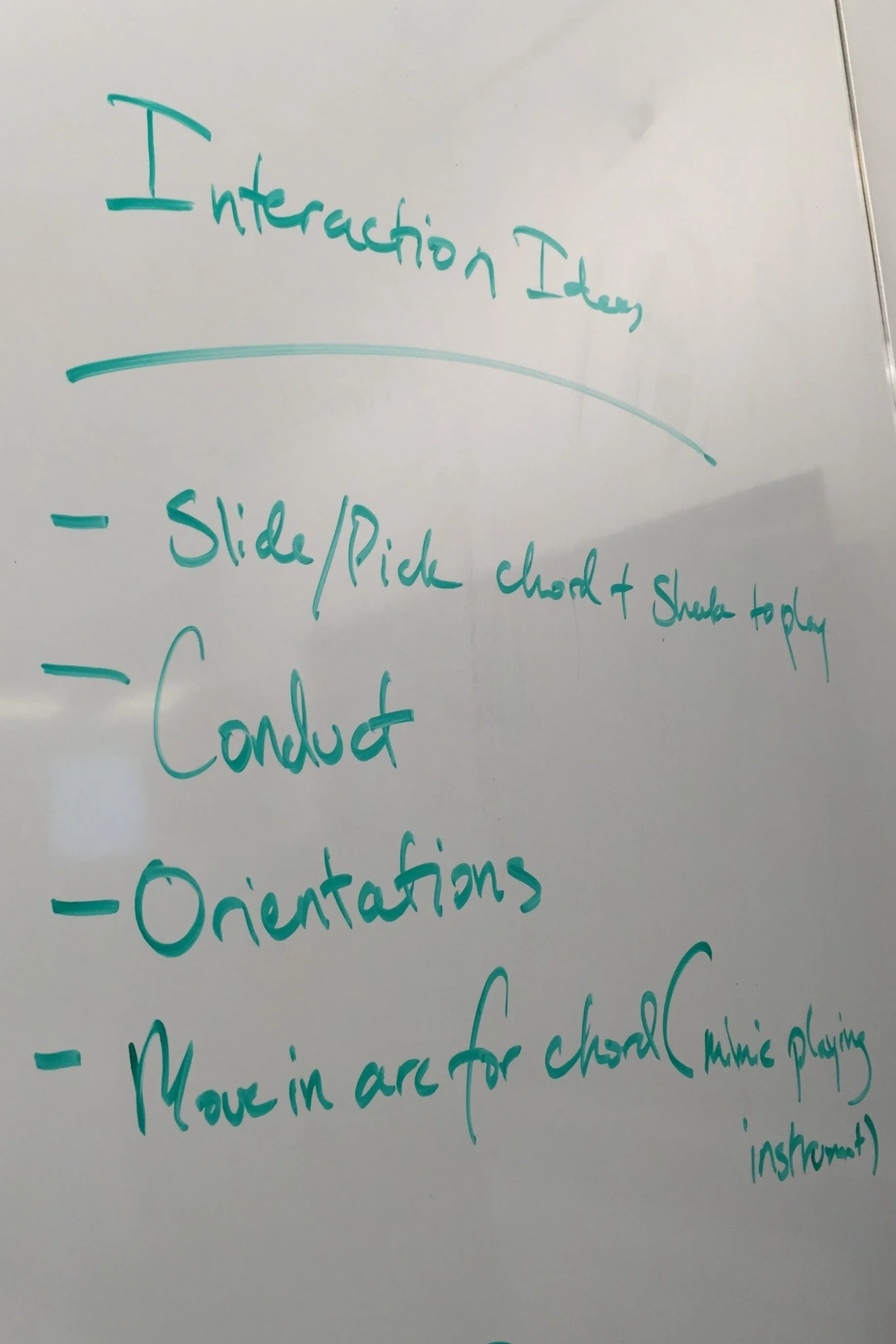
I captured our ideas on a whiteboard for interactions with a guitar

Sketch and interaction notes of the first concept we had for MetMusic’s interactions

Initial Wireframes
We completed our technical exploration and Ianded on Unity as the tool we wanted to use since Carl and Rey were familiar with the tool and could build the proof of concept fast.
I created wireframes to demonstrate how the feature would work on device. This artifact allowed us to define the step by step interactions the visitor would do in order to experience our feature without having the look and feel defined. I chose wireframing as the first step so that we could focus on refining the task flow.
Before creating the wireframes, I downloaded and explored the Met app to see what their experience is like. This allowed me to understand what app experiences the Met already had.
Based on the team’s competitive analysis and the review of the Met’s app, I then recommended that MetMusic could integrate to the main Met app as a feature rather than a stand alone experience. By doing this visitors would only need the Met's app to experience MetMusic versus being directed to the App Store/Google Play Store to download another app. This would help increase discoverability and reduce friction for visitors to engage with MetMusic.
Outcomes
Wireframes - design documentation of the MetMusic experience

Playtesting Round 1
While I was creating the wireframes, Carl and Rey coded a prototype of the interaction we had sketched earlier to create the interaction of moving the phone in an arc to change notes. We decided to do a quick round of playtesting to see what the interaction would look like in open space.
We found a few students to playtest a first version with some interesting results. One tester moved her entire body in a circle instead of just the phone for example! This test showed us that we had definitely created something new, but that it could lead to some confusion in how to perform the action with all participants taking time to figure out how to get the interaction to work and struggling to replicate any notes they were able to get. We decided to keep the interaction as it was designed since we hadn’t developed the full experience to help the user learn the interaction.
Outcomes: user feedback on interaction model

First Progress Check-in & Design Iteration
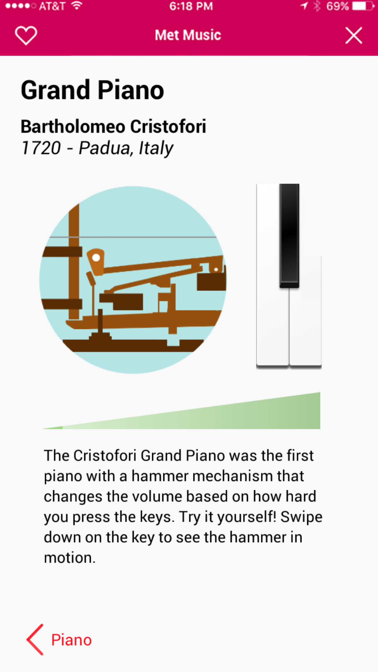
We had our first client check-in to show our progress and get feedback. This meeting included Marco, our main point of contact for the client, and the curators in the Department of Musical Instruments, stakeholders in the project since we were creating a feature for that exhibit. They were interested in our work but asked that we change the focus of our project to highlight an instrument called the Cristofori Piano, the first hammer-key keyboard instrument. The curators wanted us to focus on the internal mechanism of the Cristofori, which is why the piano is historically significant.
Outcome: client feedback on progress
After this check-in, I created the first visual mockups of MetMusic. This deliverable documented our shift to the Cristofori Piano and conveyed look and feel.
In response to the ease of use issues we had from the first round of user testing, when the page was first launched, a tutorial would display and could be triggered again by tapping on the ? icon in the bottom right corner.
We also updated our interaction model:
To change the note played, the player still moved the phone around in front of them within a 180 degree arc. Even though our playtest had shown that people had unanimously struggled with this interaction, we still wanted to honor the client’s note to create novel interactions. We also thought that a tutorial would help teach users how to play (spoiler alert: we were wrong 😬)
To play a note, the player would shake the phone. The harder the user would shake their phone, the louder the note would be. This was to replicate the motion of the hammer in the piano hitting the key, another note from our stakeholders.
For content, I created an version of the hammer-key to be animated. This was based off a Google Doodle since it was the best visualization of the Cristofori piano mechanism and do not have an illustration background - if MetMusic were to be developed into an actual feature, I’d contract an illustrator to fit the look and feel of the Met’s app. I also exported art assets for Rey and Carl to build the animation of the hammer hitting the key.
The look and feel of the piano was based on the actual instrument, which has wood keys.
We built the new prototype with the updated designs and took it for a first round of playtesting.
Outcomes: high fidelity mocks, high fidelity prototype

Playtesting Round 2
When we playtested with the second version of MetMusic, we had three people test the app. We gave them an explanation and then let them walk through the tutorial and try to play a sound. All three people failed to complete the task - we found that people were still struggling with the core interaction model and thus were not able to focus on the content being presented.
However, playtesters did enjoy the piano once they'd gotten past the learning curve of the custom interaction. But ultimately, we found that none of our core goals were being met.
Outcomes: user feedback on app design and usability

Redesign
Based on the playtest results, the team collectively decided to do away with the custom interaction and go for something much simple. We whiteboarded ideas for the new version of MetMusic that would match our goals better. This sketch shows the direction we went with, which split the content into two pages.
On the landing page, we wanted the user to see information about the mechanism, which we prioritized because that was a stakeholder requirement. The goal was to balance content and play so we kept the word portion light with the assumption that users would be more interested in interacting with the app.
The interaction model was simplified to use mobile interactions. Now users would swipe on a piano key in order to trigger the internal mechanism animation, which was the key piece of content that the curators wanted the public to know about. How the user swipes on the piano key affects volume - swipe fast and the piano is loud, but swipe slowly and the piano is softer, replicating the audio affect of tapping the piano keys. When the user swipes on the key, a volume bar under the animation fills up to show how loudly/softly the piano is playing in addition the piano sound being triggered. So still a little exploration to do, but we asked way less of the user in order to engage.
The second page replaced the whole octave with four notes to form a chord. Again, this was to simplify the experience - we wanted the user to have fun playing the instrument while learning but not create an experience that was too long and drew the user’s attention away entirely from the exhibit. We wanted a small but complete experience that could scale to multiple instruments.
We did an unofficial playtest of the new design with a few students and had much more success, with more playtesters able to figure out and repeat the interactions.
Outcome: drafted a redesign of MetMusic and created high fidelity mocks and prototype to simplify


Final Presentation and Public Demo
Our final milestone was demonstrating the work to Marco (our client) and the curators from the Hall of Instruments (our stakeholders). We walked them through our decision making and they were really happy with the final product.
As part of the class, we demoed our work at the Met Digital Open House, where the Met shows off all of the digital experiences they have been working on. We had many visitors of all ages come and play with MetMusic, from members of the Musical Instrument department to families visiting the Met. We got some great observations on where to go next as well as lots of encouragement to keep going with the project; visitors frequently asked when they would see the app, and a few kids enjoyed filling the room with the sounds of the piano.
Outcome: did our final demonstration to the client, demoed the application to the public and collected emails from attendees who were interested in learning more about MetMusic as a way to gauge interest.
Lessons Learned
Playtest frequently - we didn't playtest as early as we wanted during our sprints, so while we were able to iterate on MetMusic we could have done it earlier to prevent the redesign development in the last two weeks of the class.
Novel interactions can take away from the experience - simple was the best way to go, and the playfulness came from the overall experience in the end. Looking back on it now, we were putting a massive cognitive load on the user to try and get a sound out of their phones. Trying to keep the phone at a certain angle to get a specific note and shaking the phone is difficult, and it has accessibility concerns.
Collaborate with the client, don't consult - the feedback we got from Marco and the Musical Instruments Department at the Met gave us a lot to work with for content and design. They were our partners and were included in our process. We enjoyed working with them and hope that they did as well. In exploring the shaking and moving the phone in an arc, we did respect the client’s wishes to try a novel interaction but ultimately we came back with data informed decisions to change it and they respected that because they trusted our expertise.
Don't be afraid to start over - Even with the two weeks left, the team wanted to push for the best experience possible. We fortunately didn't have to start over completely, but in not trying to pull in preexisting code and design concepts we were able to create a much more successful product.